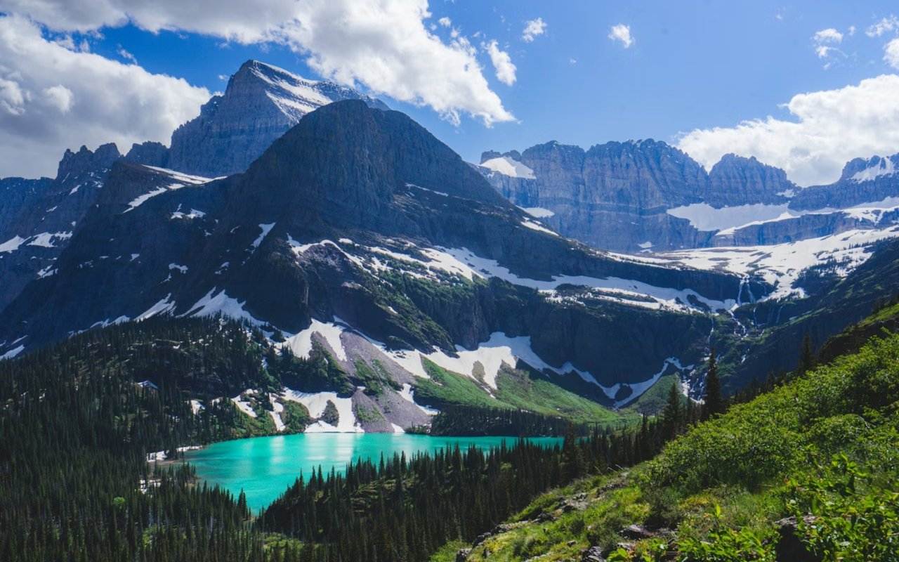
When you look around Montana, you are surrounded by a stunning backdrop that feels like a living masterpiece. Towering mountains stretch across the horizon, expansive valleys shift colors with the seasons, and the lakes shimmer under vast skies.
This natural setting provides endless inspiration for creating interiors that feel in tune with the environment. Choosing paint tones that reflect the surrounding beauty allows you to bring that sense of place into your home in a way that feels intentional and lasting. Whether you are designing your dream space or preparing a property for success in the market, a carefully chosen palette can create harmony between your walls and the great outdoors just beyond them.
Color psychology demonstrates that shades taken directly from nature have an immediate influence on mood and perception. Soft greens and earthy browns mirror the tranquility of nearby forests, while cooler blues reflect the crisp waters of Flathead Lake and the ridges of Glacier National Park. Even understated neutrals inspired by stone and soil bring a grounding element to interiors, helping a space feel balanced and steady. When your palette originates from Montana’s natural wonders, your home feels more connected and welcoming.
Understanding the Psychology of Color
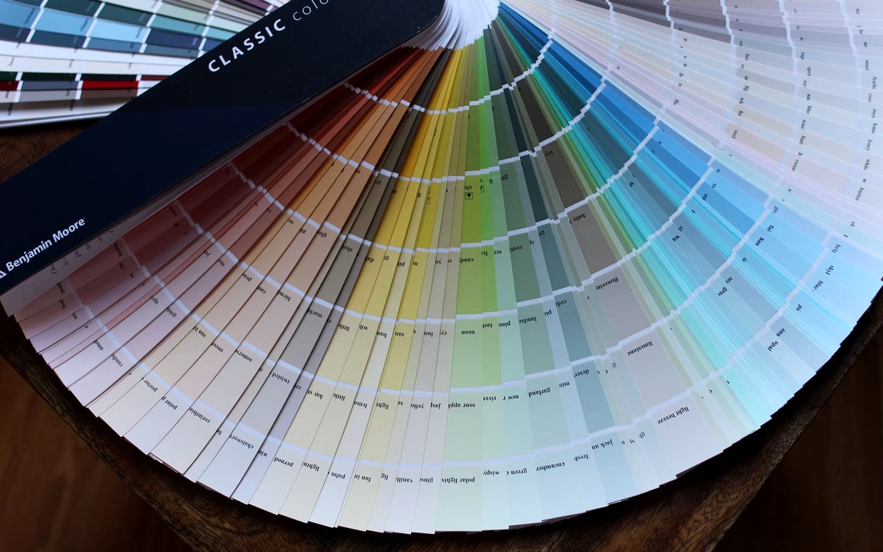
Before you begin painting, it is important to consider how color affects both the look and the feeling of a space. Certain tones can make a room feel more open and airy, while others encourage a sense of closeness and comfort. In Kalispell homes, where a connection to the land is often central, many homeowners lean toward hues that replicate the calm and beauty of the great outdoors.
Blues are well known for creating a sense of calm, focus, and clarity. A soft blue wall in a living room or bedroom recalls the expansive sky and brings a sense of openness indoors. Greens encourage renewal and balance, which is why many designers recommend sage or olive tones in kitchens or entryways. Earth tones, such as beige, warm sand, and taupe, add a feeling of groundedness, creating an inviting backdrop for both rustic and modern interiors.
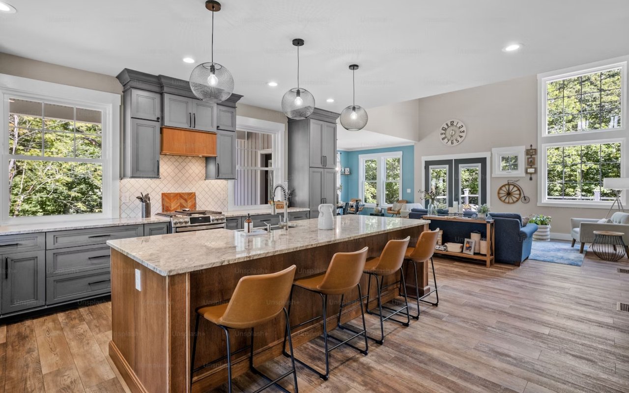
Your choice of paint also influences how people perceive the space itself. Lighter shades reflect more natural light, making rooms feel larger and brighter — particularly useful in spaces with fewer windows. Deeper shades, on the other hand, create intrigue and depth, perfect for a cozy den or study.
By thoughtfully layering these colors, you can guide how each room feels and flows, giving your Kalispell home a sense of balance that resonates.
Blues are well known for creating a sense of calm, focus, and clarity. A soft blue wall in a living room or bedroom recalls the expansive sky and brings a sense of openness indoors. Greens encourage renewal and balance, which is why many designers recommend sage or olive tones in kitchens or entryways. Earth tones, such as beige, warm sand, and taupe, add a feeling of groundedness, creating an inviting backdrop for both rustic and modern interiors.
Your choice of paint also influences how people perceive the space itself. Lighter shades reflect more natural light, making rooms feel larger and brighter — particularly useful in spaces with fewer windows. Deeper shades, on the other hand, create intrigue and depth, perfect for a cozy den or study.
By thoughtfully layering these colors, you can guide how each room feels and flows, giving your Kalispell home a sense of balance that resonates.
Drawing Inspiration From Montana’s Seasonal Shifts
Few places experience seasonal change as dramatically as Kalispell. Each season offers a completely different palette, and by drawing on these transformations, you can design interiors that feel timeless yet dynamic.
Spring brings fresh greens, lavender blooms, and crisp skies. Translating these shades into interiors might mean a sage accent wall paired with light wood or a soft lavender tone in a guest room for a hint of freshness. Summer in the valley is marked by golden light, warm earth tones, and reflective blues from lakes and streams. These can inspire beige or sandy neutrals paired with coastal-style blues that feel light yet grounded.
Autumn transforms the landscape with amber, russet, and copper tones. These rich colors translate beautifully into accent walls or trim, adding warmth and depth. Winter provides its own inspiration: clean whites, cool grays, and deep evergreen shades that reflect the stillness of snowy peaks and pine forests.
By aligning your paint selections with this rhythm, you allow your home to feel like an extension of Montana’s ever-changing landscape. While you may not repaint your home every season, these shifts help you choose a base palette that feels adaptable year-round.
A neutral shade with subtle undertones — such as a warm gray or sandy beige — can be paired with different seasonal accents, allowing your home to evolve while remaining cohesive. This seasonal awareness ensures that your interiors always feel connected to the world outside.
Creating a Harmonious Flow Between Indoors and Outdoors
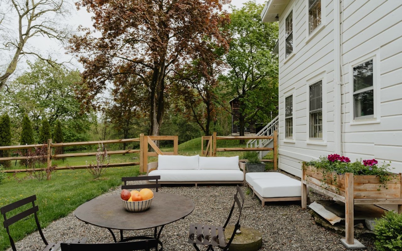
In Kalispell, windows frame incredible views of mountains, valleys, or wooded areas. By designing your color palette as an extension of these outdoor scenes, you create a home that feels naturally integrated with its surroundings. When you step inside, the transition from outside to inside feels seamless and intentional.
If your living room overlooks the peaks, shades of gray and soft blue can echo that view and extend it visually into the room. Homes with wooded backdrops benefit from muted greens or warm browns, which carry the sense of the forest indoors. Kitchens and dining areas often feel most welcoming when they borrow earthy shades reminiscent of the valley’s farmland and fields, grounding the space.
This approach works not only indoors but also on the exteriors. A home painted in tones like stone gray, cedar brown, or muted sage blends effortlessly with the backdrop. Choosing tones with the environment in mind helps your property feel timeless, rooted, and inviting.
How Lighting Influences Paint Tones
Another important factor in choosing paint is understanding how Montana’s distinctive light interacts with color. The high-elevation light in Kalispell is sharper and more direct than in many other regions, making hues appear different throughout the day. A color that looks warm and inviting at sunrise might appear cooler at midday and shift again in the evening light.
Cooler tones like gray and blue often appear brighter and sharper under the midday sun. Warm tones, such as beige, terracotta, or gold, soften in that same light, bringing balance to open spaces. Winter, with its shorter days and diffused sunlight, can make deeper tones feel darker, which means thoughtful lighting choices become even more essential. Testing samples on walls at different times of day gives you a true sense of how a shade will look in your space.
Interior lighting plays a significant role. Warm bulbs can enhance earthy tones, creating a cozy glow, while cooler bulbs highlight grays and whites for a crisper finish. Layering natural and artificial light ensures your chosen colors adapt beautifully to every setting.
Bringing It All Together
Your home in Kalispell is more than just a structure; it is a reflection of the world around it. When you draw on Montana’s landscapes for inspiration, you create interiors that feel grounded, calming, and enduring. Whether you embrace the deep blues of Flathead Lake, the earthy greens of nearby forests, or the golden tones of sunlit meadows, your choices tell a story of connection to place. If you’re ready to find a beautiful home in Kalispell, Whitefish, Bigfork, Eureka, or beyond, National Parks Realty is by your side. Reach out today.